The Role of Colors in Simplicity: How to Choose Palettes that Convey Calmness and Clarity
Understanding the Impact of Color Choices
Colors have the remarkable ability to evoke feelings and influence mood. From the vibrant red of a traffic signal to the calm blue of a clear sky, these hues play a vital role in our everyday environments. When choosing a color palette, especially for minimalist designs, understanding their emotional and psychological impact becomes essential.
The Power of Calmness and Clarity
In a world overflowing with distractions, simplicity in color palettes can help convey serenity and focus. Colors can serve as not just decorative elements but also essential components that influence psychological well-being. For example, a study from the University of Washington found that individuals exposed to natural lighting and calming colors reported lower stress levels and increased productivity.
Here are some key aspects to consider when selecting colors:
- Color Psychology: The field of color psychology explores how colors affect human behavior. Different colors trigger different emotions. For example, greens can promote tranquility and healing, commonly associated with nature, while yellows can inspire energy and optimism, reminiscent of sunlight. Brands like Whole Foods use green to convey a sense of health and freshness, suggesting that color can play a crucial role in branding and consumer behavior.
- Balancing Brights with Neutrals: Bright colors can grab attention, but when paired with calming neutrals, they create a harmonious balance. In minimalist designs, using a bright accent against a soft beige or gray backdrop can add vibrancy without overwhelming the senses. Imagine a stark white room enhanced by a vivid emerald green cushion — this simple addition can inject life while maintaining an overall sense of peace.
- Context Matters: The environment in which colors are used greatly influences how they’re perceived. For instance, indoor spaces may benefit from softer tones like pastel blues or muted earth tones to foster relaxation, while outdoor designs, like a head-turning public mural, can utilize bolder accents like fiery reds or deep blues to attract attention and energize the space.
By strategically selecting color palettes that embody calmness and clarity, emphasizing simplicity can lead to a more focused and peaceful atmosphere. This guidance can benefit anyone from designers crafting a brand identity to homeowners looking to create inviting and tranquil spaces. A thoughtfully curated color scheme can set the tone, making a significant difference in how one feels while interacting with their environment.
The Journey Begins
As we delve deeper into the world of colors, you’ll discover how to creatively implement these principles in your own projects. The effective use of color can turn an ordinary space into an extraordinary one, inviting both comfort and inspiration. Let’s explore how to make informed choices that resonate with simplicity and elegance, enabling you to elevate your designs and environments to new heights.
By embracing the art of color selection, you are not merely decorating—a journey into the psychological effects of color awaits, one that can profoundly impact both your life and the lives of those around you. The path to creating spaces that captivate and soothe begins with a single choice: the color you select.
DIVE DEEPER: Click here to uncover the benefits of minimalist organization
Exploring Tranquil Color Selections
Choosing a color palette that promotes calmness and clarity requires not just an eye for aesthetics, but also a deep understanding of how colors interact with our emotions and perceptions. The simplicity of a color scheme can enhance focus, encouraging a more peaceful state of mind. Many professionals, ranging from interior designers to graphic artists, have embraced this concept by curating color spaces that reflect serenity. By understanding the nuances of color relationships and the emotions they manifest, you can create environments that are both inviting and relaxing.
The Emotional Spectrum of Colors
The emotional responses to colors are deeply embedded in cultural and personal experiences. Research in color psychology indicates that different hues can evoke specific feelings or responses. For example:
- Blue: Often associated with tranquility and stability, blue can create a sense of calm. It’s no wonder that many offices incorporate shades of blue into their designs, as this color can help reduce stress and enhance concentration.
- Green: This color is linked to nature and renewal. Environments incorporating green tones can promote feelings of relaxation and rejuvenation, making greens a popular choice in spas and wellness centers.
- Soft Gray: Gray represents neutrality and balance. In minimalist designs, it adds sophistication and depth without overwhelming the senses. Using varying shades of gray can create a serene backdrop that allows other colors to shine.
- Lavender: A gentle hue, lavender can instill calmness while adding a touch of elegance. It’s becoming increasingly popular in both home decor and branding as creatives look to establish a soothing atmosphere.
As you can see, understanding the connotations associated with colors enables you to harness their power effectively. The challenge lies in finding the right balance among these colors to create a harmonious palette that resonates with simplicity. When designers thoughtfully mix these colors, they elevate their projects into cohesive designs that not only please the eye but also support mental and emotional well-being.
Creating Cohesion Through Color Harmony
In the pursuit of simplicity, color harmony becomes paramount. This involves selecting colors that work together to create a unified look and feel. Color wheel principles can guide this process. For instance, complementary colors—those opposite each other on the wheel—tend to create vibrant contrasts that can invigorate a space. However, when aiming for a calm atmosphere, a more monochromatic or analogous color scheme, where colors are adjacent on the wheel, often fosters a soothing environment. Implementing this principle can transform stark designs into welcoming spaces, effective in both corporate settings and private homes.
As you embark on designing spaces or projects with a focus on simplicity, consider the emotional responses you wish to evoke. The right choices can profoundly influence your environment, leading to enhanced tranquility and clear-mindedness for you and your audience.
| Color Psychology | Impact on Emotion |
|---|---|
| Blue | Promotes feelings of tranquility and trust, making it ideal for calming spaces. |
| Green | Symbolizes nature and balance, contributing to a sense of refreshment and renewal. |
| Soft Neutrals | Provide a clean, unobtrusive backdrop that enhances focus and promotes clarity. |
| Pale Pastels | Add a subtle warmth while maintaining a light and airy atmosphere, encouraging creativity. |
Choosing the right colors plays a pivotal role in creating environments that evoke calmness and clarity. The psychology behind color selection can significantly influence mood and perception. For instance, the color blue is often used to instill a sense of serenity and reliability, making it particularly desirable in spaces meant for relaxation or focus. In contrast, greens are reminiscent of nature, fostering a sense of balance, which can be especially refreshing in modern interiors.Furthermore, incorporating soft neutrals can refine aesthetics whilst promoting an undistracted atmosphere optimized for clarity. These shades allow other elements of design, such as textures or furnishings, to stand out without overwhelming the senses. Additionally, utilizing pale pastels can breathe life into environments without inducing chaos; these colors maintain an ethereal quality conducive to artistic inspiration. Understanding these aspects of color can empower designers and homeowners alike to create spaces that harmonize tranquility with functionality, nurturing environments that engage the mind and soothe the spirit.
DISCOVER MORE: Click here for essential tips
Practical Applications of Calming Color Palettes
Understanding how to choose color palettes that foster calmness and clarity can be transformative in various settings, from home interiors to workplaces and public spaces. This practical application of color theory emphasizes that intentional choices can yield significant psychological benefits. Examining specific environments where color plays a critical role unveils the potential for simple changes to create lasting impacts.
Home Interiors: Refuge in Color
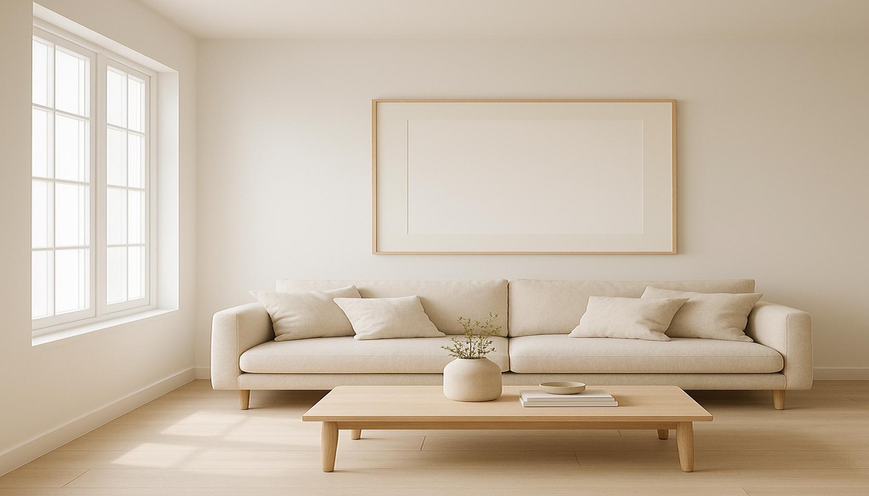
In residential spaces, utilizing calming palettes can turn a house into a tranquil sanctuary. Many homeowners are increasingly gravitating towards soft, muted colors that allow for a seamless integration of simplicity and serenity. For instance, a living room painted in a soft earthy beige combined with accents of sage green can evoke a sense of grounding, while also enhancing natural light. This approach, focusing on a minimalistic design with fewer accessories and furniture pieces, encourages open space and not only beautifies the home but also creates an inviting atmosphere.
- Layering Colors: One effective method of achieving tranquility is through layering shades within the same color family. For example, a suite of cool blues can be combined, ranging from icy pastels to deeper navy hues, fostering depth and interest while maintaining a cohesive aesthetic.
- Color Flow: It is essential to create a continuous flow of color throughout different rooms. By using adjacent colors, rooms can organically connect to each other, maintaining a sense of calm as individuals transition through various spaces.
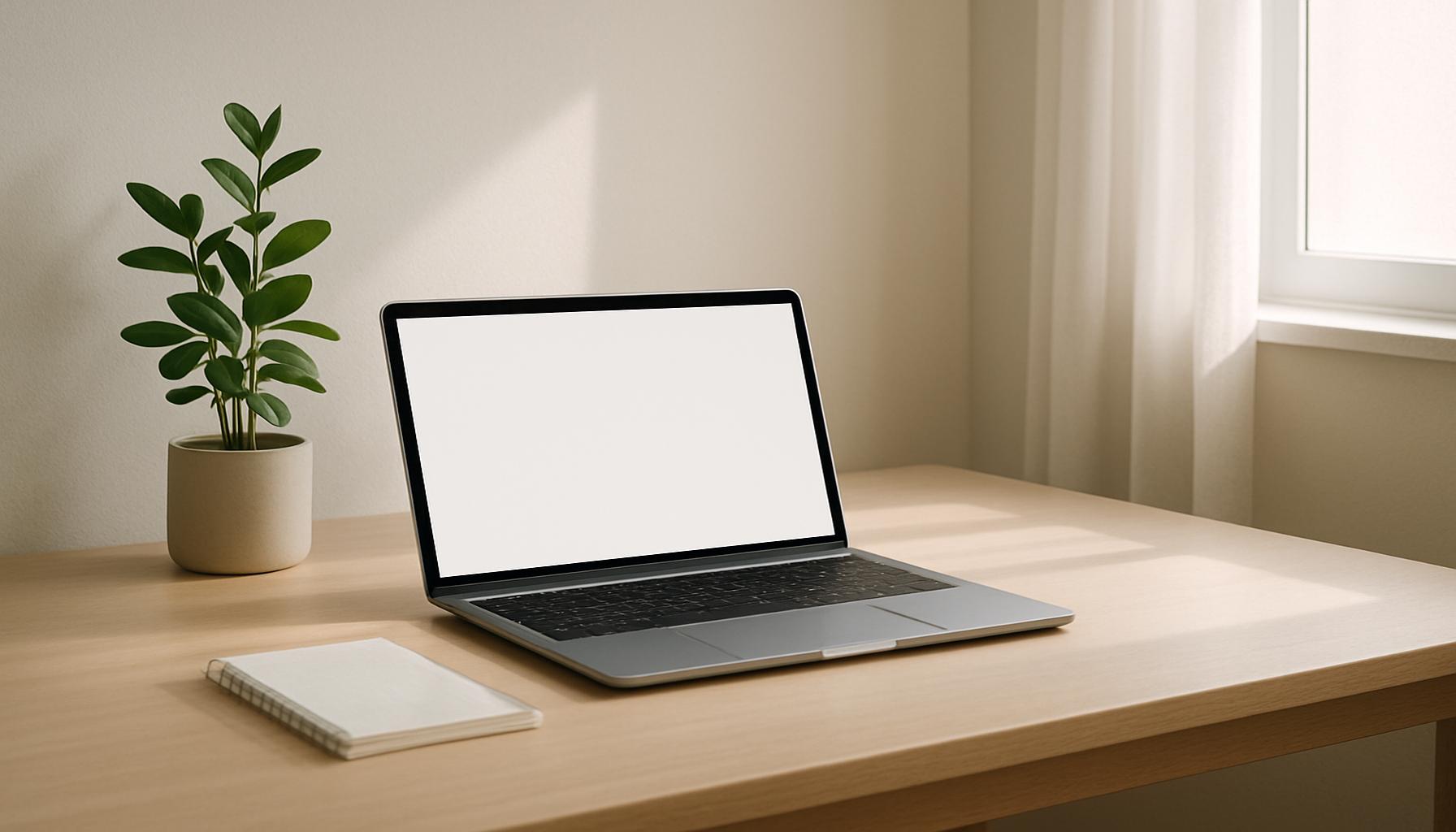
Workspace: Boosting Productivity through Calmness
The significance of color extends to professional settings as well, where employees are increasingly subject to stress and distractions. Colors chosen for workspaces can directly influence focus and efficiency. Research conducted by the University of Texas found that blue-tinged light can increase focus and overall productivity, making it an ideal choice for office environments. To further enhance the work experience, integrating green plants into predominantly blue or gray spaces can yield a refreshing effect, reducing workplace anxiety and fatigue.
Additionally, the trend of adopting biophilic design in offices promotes the incorporation of natural elements such as plants, water features, and natural light. This design philosophy not only embraces colors found in nature but reflects a growing emphasis on the psychological benefits that come from being in harmonious, calming environments.
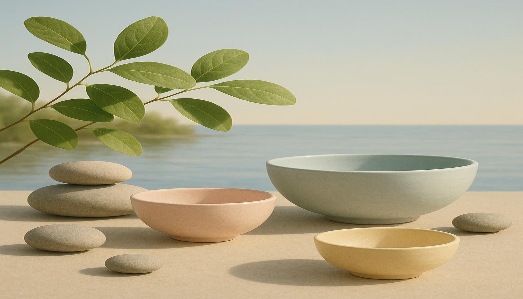
Public Spaces and Wellness Centers: Creating Safe Havens
When choosing colors for public spaces, such as hospitals, schools, and community centers, it is crucial to consider the emotional responses these environments evoke. Using soft palettes of green and soft yellow in healthcare settings has been shown to reduce anxiety in patients, supporting the healing process. Such calming colors, when coupled with appropriate lighting, can craft a comforting atmosphere amidst the typically stressful contexts of medical facilities.
Meanwhile, wellness centers and spas often utilize calming palettes to provide relaxing experiences for visitors. Shades of soft blue and muted lavenders are common in these spaces, designed to promote mindfulness and relaxation. The strategic use of these colors, supported by thoughtfully chosen furnishings and decor, can create an environment where clients feel nurtured and stress-free.
As we explore these diverse applications of color psychology, it becomes evident that mindful color selection is indispensable for fostering environments that promote clarity and calmness. The impact of color extends far beyond aesthetics, influencing our emotional and psychological well-being in everyday settings.
DIVE DEEPER: Click here to learn effective task prioritization
Conclusion: Embracing the Power of Color
In conclusion, the role of colors in simplicity is profound and multifaceted, offering us the tools to create environments that promote calmness and clarity. By thoughtfully selecting color palettes, we can transform spaces into sanctuaries of peace that positively influence our emotional and psychological well-being. From the soothing earthy tones of home interiors to the productive blues of workspace environments, color has the power to shape our experiences and perceptions.
Moreover, the applications extend beyond personal spaces; public places and wellness centers can significantly benefit from the psychological advantages that specific colors bring. The intentional use of soft greens and muted yellows in healthcare settings illustrates how color can foster healing, while the gentle palettes found in spas enhance relaxation and mindfulness.
The science behind color psychology is ever-evolving, inviting us to explore new combinations and arrangements that can yield even greater benefits. As we embrace the insights gained from color theory, the opportunity to cultivate calming and clear environments in our daily lives becomes increasingly accessible. Whether you are redecorating your home, designing a workspace, or planning a public facility, the colors you choose can create significant, transformative impacts. Delving deeper into the world of color palettes is not just a creative pursuit; it is a vital component in designing spaces that nurture our mental and emotional health.